 |
|


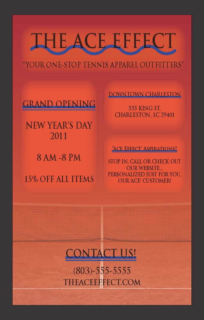 Business PromotionalFor my business flyer, I wanted to create a design where the design layout, graphics incorporated as well as the color scheme, all correlated and blended amongst oneanother. Being that I am promoting the launch of a fictitious tennis clothing store, I wanted to first and foremost include a graphic of a tennis court. This tactic was used to attract tennis players in acknowledging my business. I wanted to blend the court at the bottom of the flyer with the remaining parts of the flyer. To do so, I utilized the gradient feather tool. In addition, I stuck with a color palate consisting of primarily four colors; black, light orange, dark orange and royal blue.My specific color palate is one method I wanted to use to make sure I made a flyer that was visually appealing, attractive and eye-catching. In addition, I wanted to ensure that I created a flyer that was organized properly, using the centering command. Also, I formatted the text of my flyer to be easily read and appealing to the reader."Simple and comprehensible navigation is essential for the success of any application. Users must be able to move from page to page via links, buttons, or menu items. More importantly, navigation must also address the contenuous balance between real-life user goals and business goals of the application." - Rick Oppedisano |