 |
|


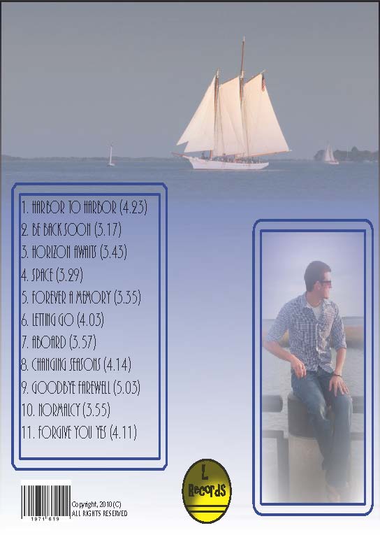
"Music CD Cover"When designing my music CD cover, I initially envisioned the front cover to emphazize the recording artist, covering the entire surface with a graphic. Being that my design is nautically-themed, I wanted my color palate to also correlate with this theme. For instance, the front cover depicts sailing on the Charleston Harbor, with Fort Sumter in the left background. I decided to utilize a coral blue for the text and a black text for the title of the album, 'Harbor to Harbor'.In regard to the back cover of the CD, I wanted to translate the design scheme of the front cover to the back cover. I again used a swatch gradient to blend a sailboat graphic at the top into the middle and bottom sections of the cover. I also liked how I designated the left half of the back cover to the track list and the right side of the back cover to another artistic graphic. This particular artistic graphic was embossed into the back, making the edges blend smoothly with the swatch gradient."Webpage building is a lot like bar tending. Build it right and it will work no matter what the container." - Glenn Davis |